Web App Design Case Study
Celanese
Celanese is a B2B industrial materials company that produces a wide range of specialty materials used in automotive parts, medical devices, consumer electronics, and industrial equipment. This project focused on leading the UX and design of MyCelanese, an e-commerce application used by external customers and internal account representatives to efficiently create and manage orders.
Goals
01. Strategically improve the user experience by addressing both user and business needs
02. Provide a richer, faster, and more efficient app experience
03. Modernize the design following current trends in UI and Design
04. Create a simple and intuitive experience that prioritizes accessibility and usability standards
Title
UX/UI Designer
Skillset
Research, Content Strategy, Information Architecture, Wireframes, Design, Testing
My Process

Scope
Define, Gather, Align

Research
Inquire, Observe, Engage

Ideate
Define, Brainstorm, Sketch

Create
Prototype, Design, Build

Validate
Test, Refine, Iterate
Scope
Discovery Workshop
The application was highly complex, involving various stakeholders across business, engineering, administration, branding, and multiple user levels. To navigate this complexity, a week-long co-creation workshop was conducted with key stakeholders to tackle discovery, define goals and requirements, and align all teams with the plan moving forward.
Key Findings
01.
One Hub
Merge six business units under one unified portal for a consistent and streamlined order management experience.
02.
Operational Efficiency
Implement self-service options for customers (external users) to help optimize customer service team’s (internal users) performance.
03.
Improve Expereince
Enhance customer experience, reduce errors in order entry and provide customers access and support 24/7.
Understanding the Users
Surveys
Insights were gathered from 10 internal app users through remote surveys. Key data points collected include:
– Overall experience in terms of frustrations
– Roles and responsibilities
– Primary goals on app
– Frequent tasks and step by step explanation of tasks
– Improvement suggestions
– New functionality and feature suggestions
Research Findings
01.
Top User Pain Points
(In order from most frequent to least)
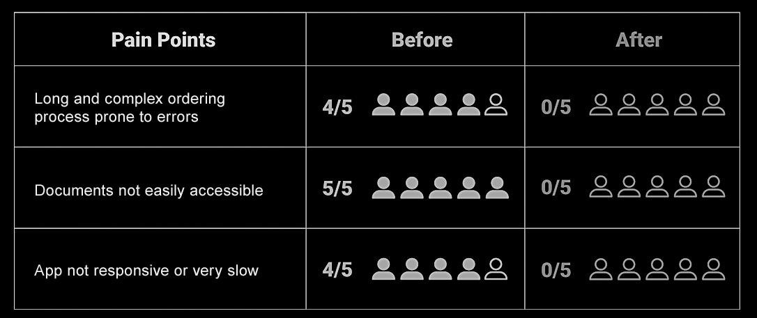
-Long and complex ordering process prone to errors
-Important documents not easily accessible on app
-Cannot access account information on the go
-No direct way to email or share documents
-App frequently not responsive or working at all
-Login very slow, sometimes can’t login at all
-Delays and bottlenecks in the ordering process
-Customer reps are more reactive and less proactive
02.
User Tasks
(in order from most frequent to least)
-Order entry / Re-ordering
-Access, print and email documents
-Retrieve data (order or payment status)
-Edit orders
-Create, maintain and delete user accounts (admins)
03.
User Roles and Responsibilities
(Different privileges and access according to user roles)
-Customer Account Reps (internal users) – Manage customer orders and accounts and provide support throughout the ordering process
-Customers (external users) – Create, track and manage orders, print documents
-Super Users / Admins (internal users) – Access to all user accounts, change and update account settings, assign customers to account reps, create and delete accounts
04.
Experience Ranking
(From worse to best)
-Ease of accomplishing goal
-Visual appeal
-Organization of the site
-Ease of navigation
-The quality and readability of the content
Ideation
Information Architecture
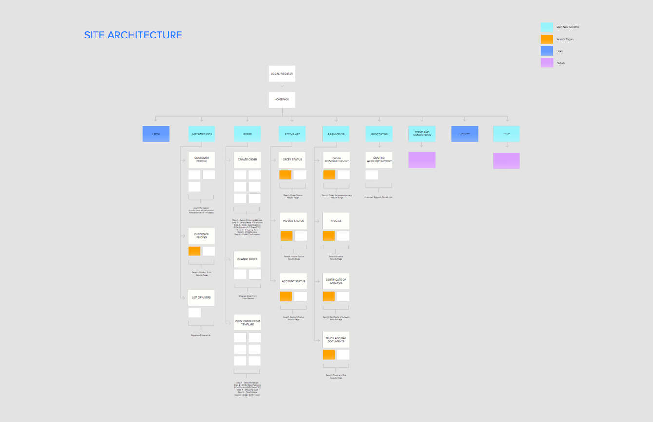
Affinity mapping was utilized to gain a deeper understanding of the workflow and touchpoints within each process. This information guided the creation of a sitemap, which outlined the various pages and sections of the app and their interconnections.
Brainstorm Sessions
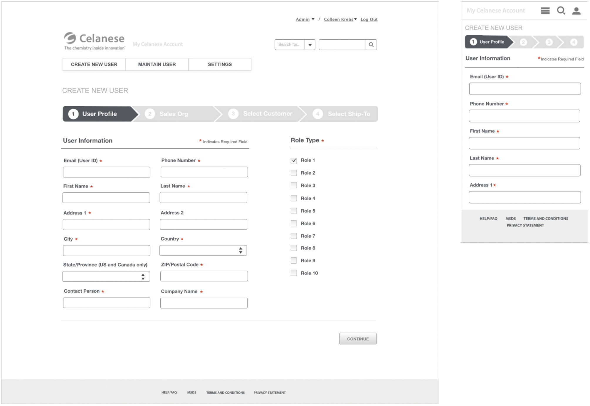
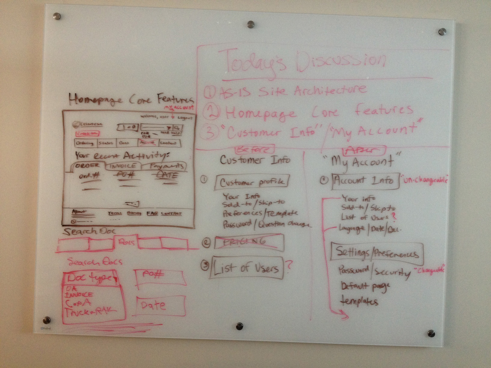
During the weeklong workshop, a lean approach was employed to plan the layout, UI, and identify essential features and functionality. The process began with quick, basic whiteboard sketches, where ideas were shared and refined with the team. This iterative method resulted in the creation of 47 detailed wireframes for both mobile and desktop.
Proposed Solutions
Each wireframe was meticulously planned and annotated to provide clear guidance on layout, functionality, interaction elements and showcase the proposed UX/UI solutions.
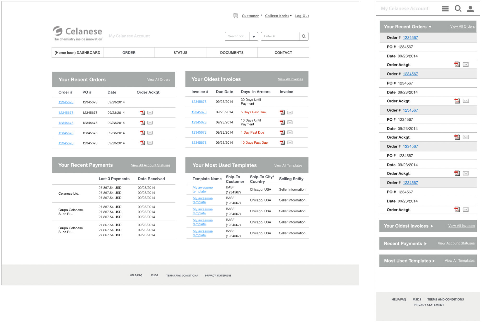
Dashboard
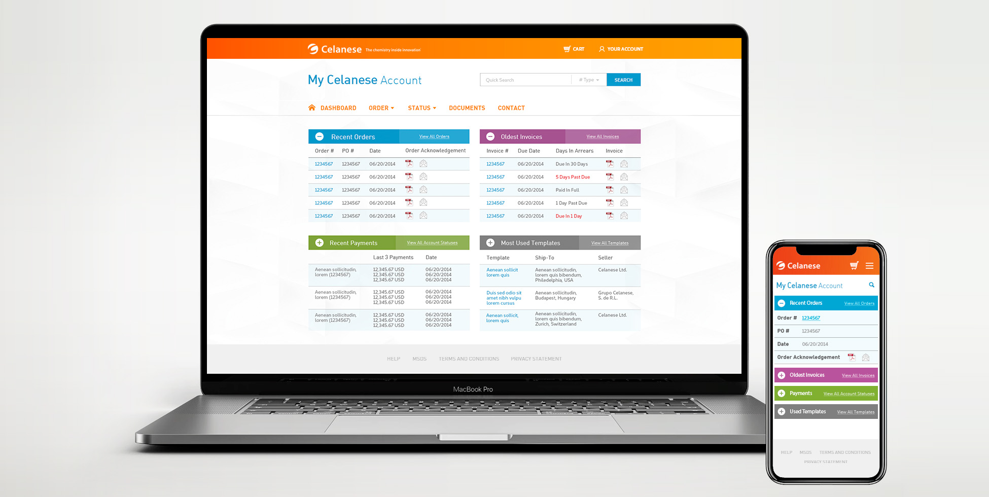
The dashboard offers fast access to what users need most based on their top tasks.
- Gives a quick overview of recent orders and payments
- Quickly mail documents from the dashboard
- Access older files easily by searching the document type or PO#
- Simplified navigation with global nav for easy access to profile, settings and shopping cart
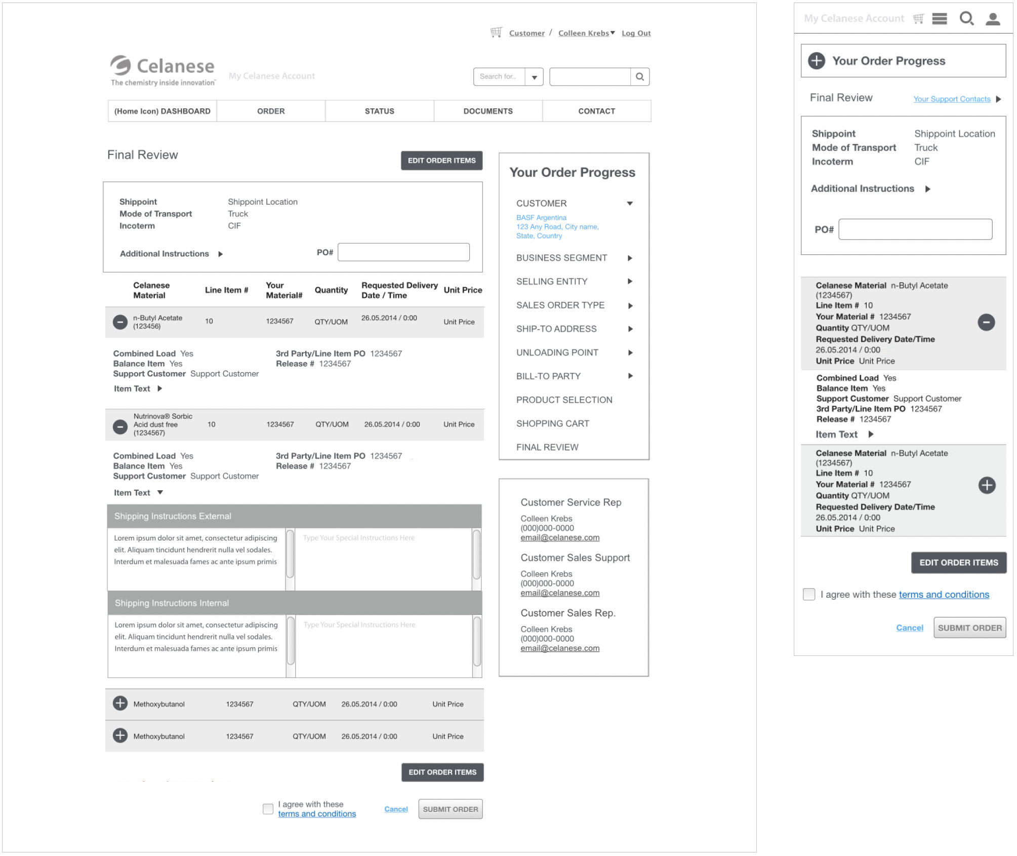
Optimized Ordering Process
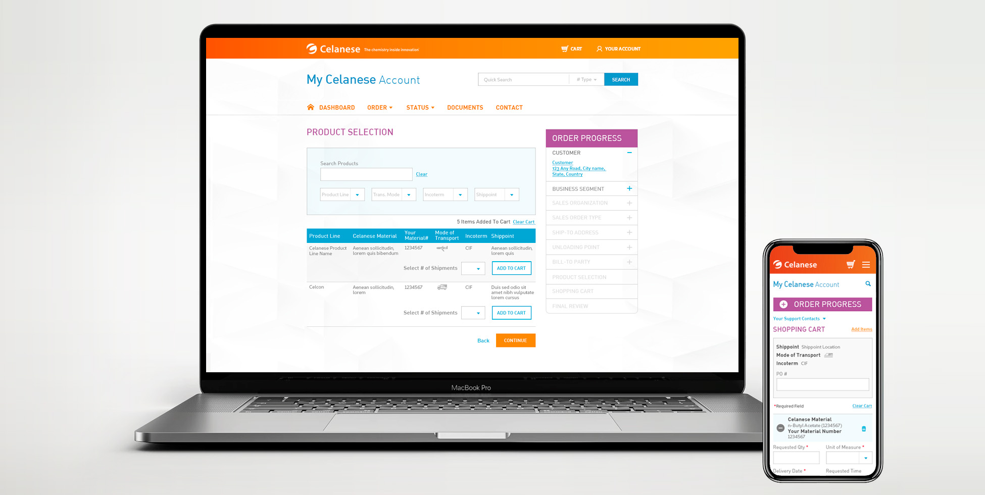
Designed a straightforward and user-friendly experience focusing on a simplified step-by-step process.
- Organized the checkout process into clear steps and grouped content for easy organization and readability.
- Incorporated expand/collapse elements to streamline scrolling and prevent clutter.
- Formatted the progress bar to visually represent the order fulfillment process, allowing users to navigate back and forth easily.
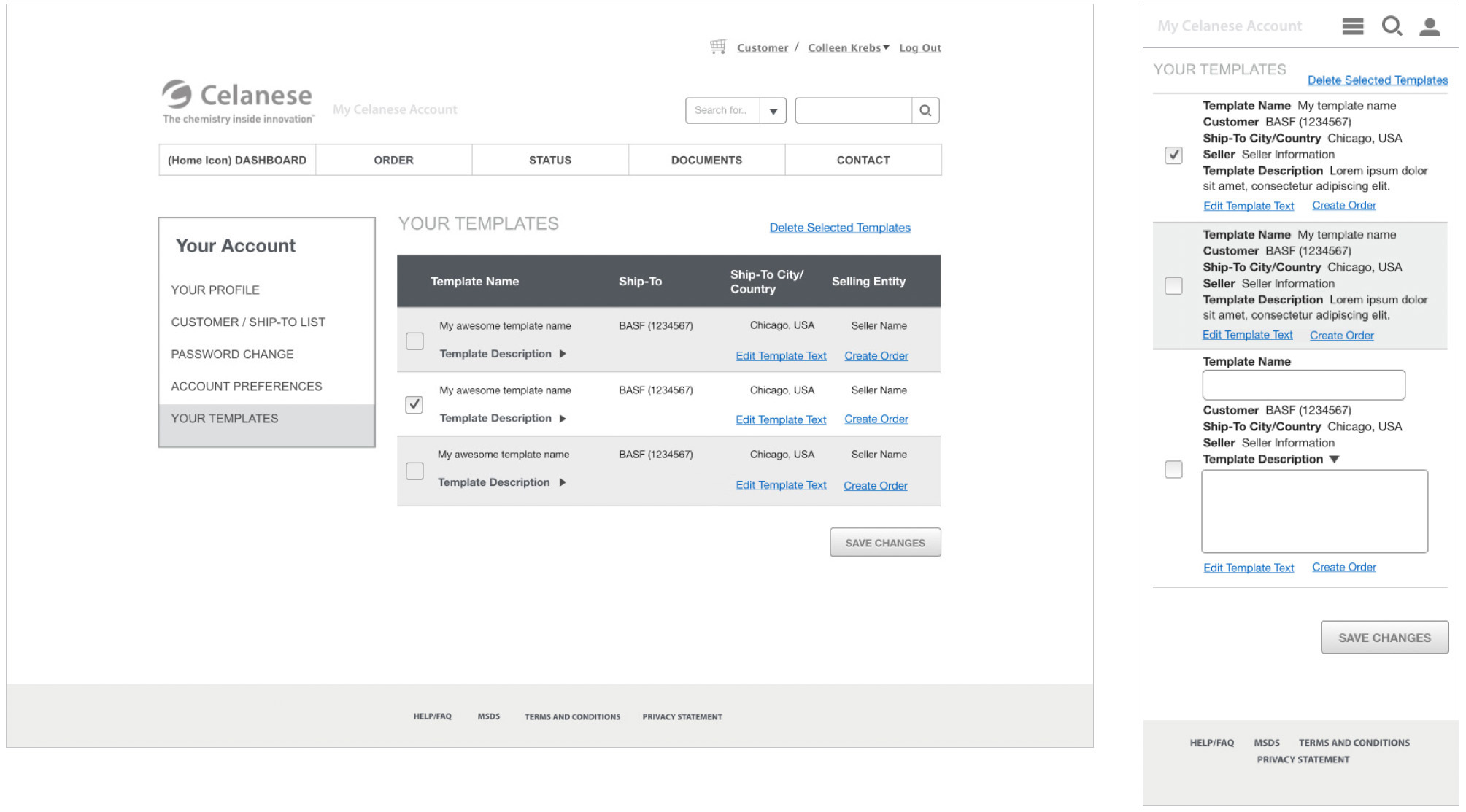
Templates
Created templates to streamline purchasing, save time, ensure consistency and prevent errors.
- Users can save, edit or delete templates to keep their collection organized and up-to-date
- Flexibility to preview and modify templates before adding to their cart
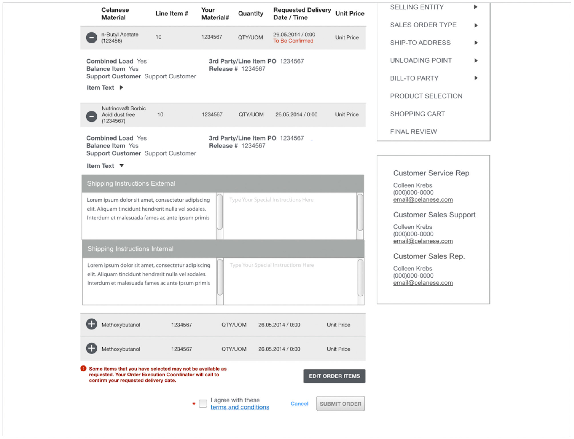
Real-time Notifications
Keep users continually informed about pending transactions, status updates and additional instructions to reduce customer support calls and troubleshooting.
Designing a Fresh and Intuitive Experience
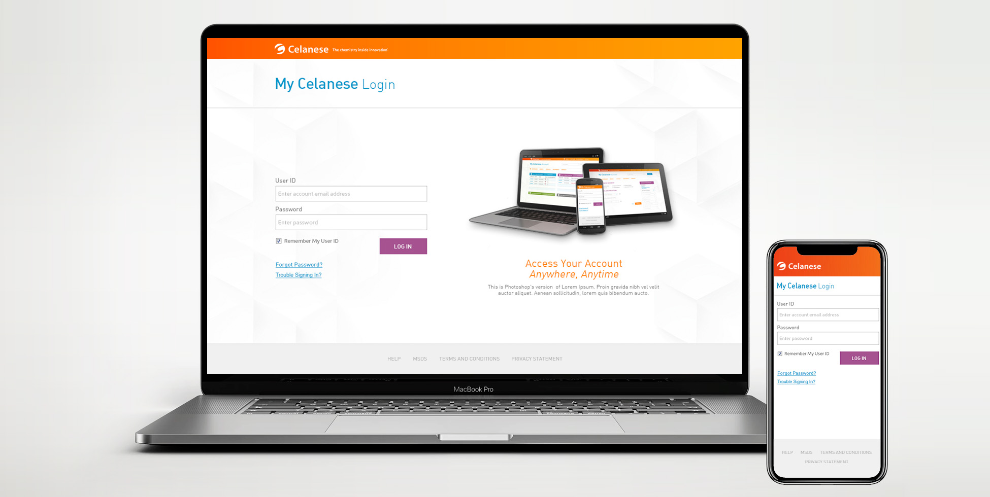
The app was designed for ease of use across both phones and computers. The interface is clear and simple to navigate, featuring well-defined sections and categories. The workflow is straightforward, divided into simple steps, while the design is fresh and engaging, with vibrant colors and a clean layout.
Validation
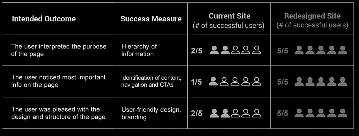
5-Second Validation Test
Prior to the final release, a 5-second validation test was conducted with 5 new participants to evaluate the information and visual hierarchy of the dashboard design. This test also assessed the clarity and effectiveness of the content.
How the test works
Participants were shown the old and new dashboard designs for 5 seconds each, after which the designs were removed from view. They were then asked about their initial impression, the main goal of the page, and the key elements or features they remembered.
Usability Test
Following the validation test, usability tests were moderated with the same 5 app users, revealing valuable insights and issues.
The findings confirmed that:
• Users navigated through the new app with ease and quickly accessed the information and documents they needed
• Users found ordering was a smoother and more informative experience
• Progress UI features helped clearly reduce uncertainty and increase transparency
• There was some confusion with icons and active/inactive links in the ordering process that were easily fixed
Key Take-aways
- The project culminated in a successful product that not only impressed visually but also performed flawlessly, leading to a significant improvement in user engagement.
- Collaborating with professionals from diverse disciplines provided valuable learning opportunities, offering insights into various approaches across business, engineering, and leadership.
- Achieved success with a small team, despite limited time and resources, navigating a highly complex process.
- This project marked the first experience of working remotely with an international team. Although coordinating across time zones was challenging, the team managed to overcome these obstacles effectively.
